

I am writing this home up for a story for Apartment Therapy LA that will post on Friday of this week, but with my writing for AT it needs to be very specific and home related I can't quiet share everything I think about a subject.
Catherine Griffiths is a graphic designer from New Zealand. Though trained in print I applaude the fact that she doesn't limit her work to that medium. I believe it's a true artist who can take their love and apply it in ways you never could imagine.
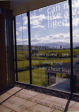
To say I'm in love with the idea of this home is an understatement. I LOVE letterforms. After taking a class in typography many years ago and forced to focus on all the nuances of a letter, say lower case "a", or lower case "g"; I fell madly in love. I now collect letterforms because of it. So imagine my delight when I saw that these people are encapsulated with letters. YUM! is about all I can say and not embarrass myself. [btw lower case "g" is my fav – in a serif font]
Griffith’s work in general is more than stunning. You can truly realize the power of good design when you look at her work, and cheer that she thinks outside the box every moment – of every day. Makes me want to quit art--sometimes people are so good at what they do you want to throw up your hands and say 'oh jeez... never mind! I give up!'
Story appears in Print Magazine, Sept/Oct 2006
Photo credit: Bruce Connew [1st photo] Jason Busch [2 &3]
No comments:
Post a Comment